The goal of this project was to revitalize the online presence of the Aquatics & Fitness Center to attract a diverse audience and create a welcoming, motivating experience. This redesign includes a streamlined navigation, responsive design, and modern branding.

The rebrand for the ESCNJ Aquatics & Fitness Center stems from a need to modernize and revitalize their image. The original logo, while reflective of the center’s mission, lacked the contemporary appeal necessary to attract a diverse audience in today’s competitive fitness industry.
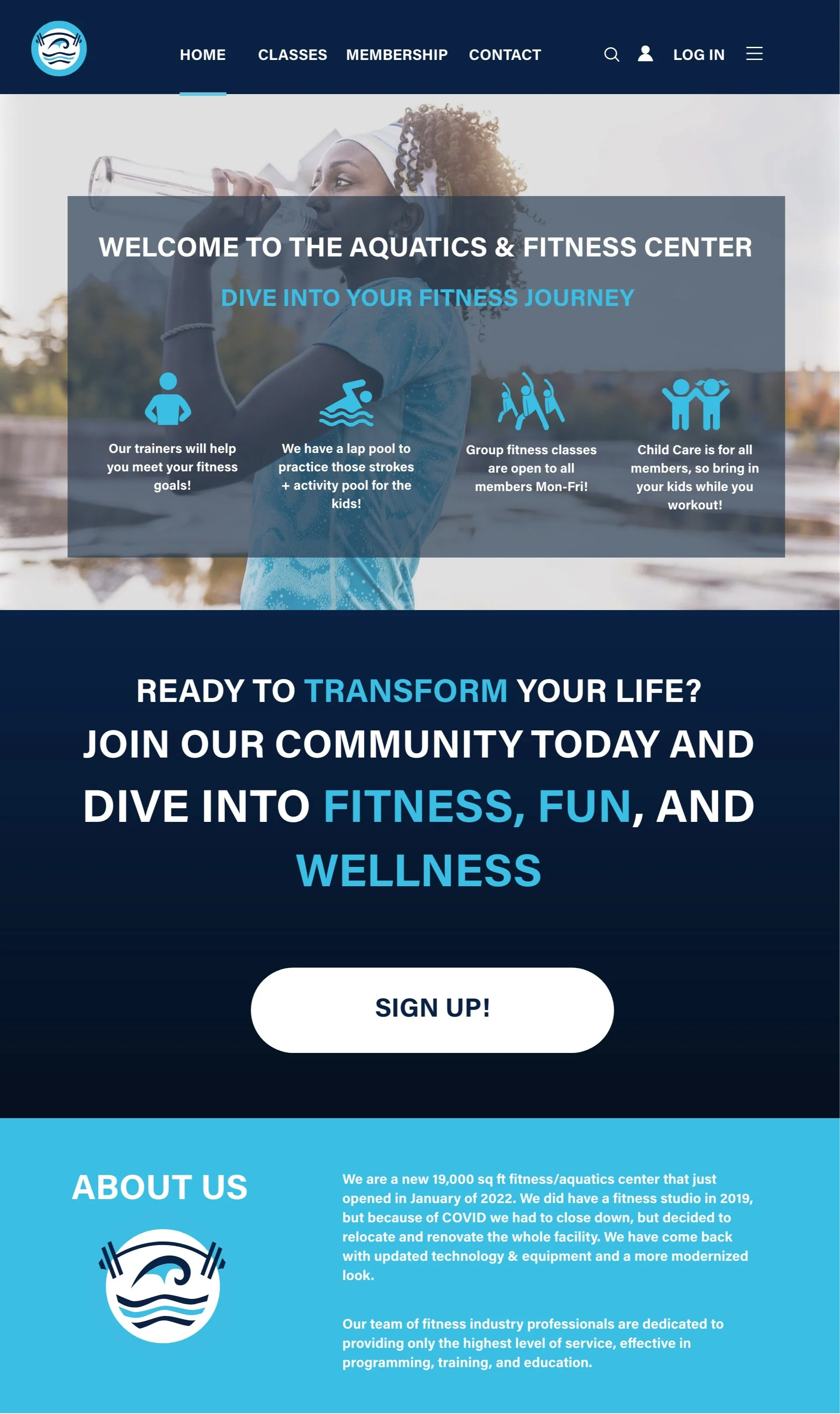
The new logo introduces a clean, minimalist design that blends aquatic and fitness elements into a cohesive, vibrant identity. The wave represents the center’s aquatic programs, while the barbell underscores its commitment to strength and fitness. This updated design aligns with AFC’s goal of creating a welcoming and motivating atmosphere that resonates with all age groups.
This rebrand is part of a larger strategy to breathe new life into AFC’s marketing efforts, fostering a stronger connection with the community and drawing more visitors as they continue to grow and evolve.

Fitness Class Selection

Homepage
Fitness Classes Page
Log In Page
Final Webpages


Homepage


ESCNJ Aquatics & Fitness Center Website Redesign
Former Logo
New Logo


Profile page
Challenges & Solutions
Challenge 1: Ensuring the website remained visually appealing while displaying a large amount of information.
Solution 1: Implemented a clear hierarchy using white space, bold headings, and iconography.
Challenge 2: Creating a design that caters to a wide range of demographics while maintaining a cohesive and modern aesthetic.
Solution 2: I used a combination of inclusive design principles, such as easily readable fonts, accessible color contrasts, and clear navigation. By incorporating a mix of vibrant imagery, clean layouts, and iconography, the site appeals to both younger and older audiences, ensuring usability across all age groups.
.


Logo
Wireframes/Sketches


AFC APP


